Twitter make analytics free to everyone:
That came as a bit of a shock to me, as it was already available to everyone – but they have indeed vastly improved one of the views (others remain the same though, ie. follower analytics).
The new dashboard:
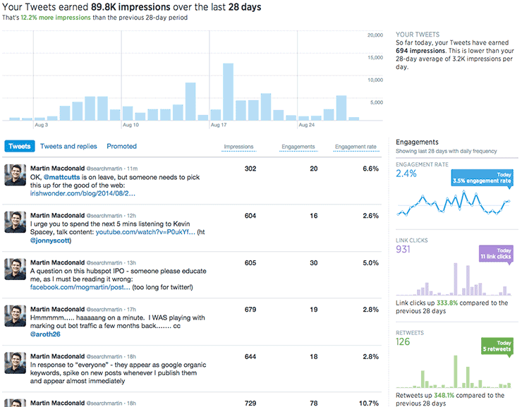
As you can see at analytics.twitter.com its actually got some really decent information, with for the first time precise counts on impressions, interactions & an engagement rate to optimise.
Based on twitters advertising platform (and Im assuming the measurement is the same) an engagement constitutes a click, favourite or retweet of a tweet, or a follow action from a tweet – they are essentially all rolled into one metric. With the old format of this view you were stuck with just that which was pretty useless if you were trying to optimise one of those individual factors.
Now however, we have some added awesome, click on the tweet in the list to reveal the following information:
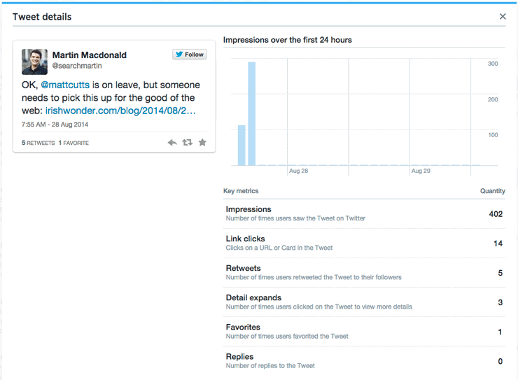
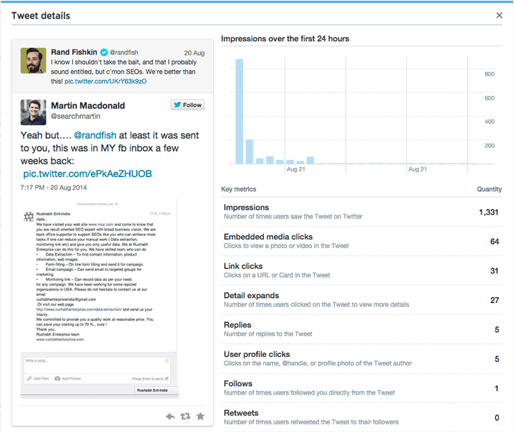
The information that is listed is tailored to the contents of the tweet itself, and the actions that were taken as a result of your tweet. The above example was a “simple tweet” with a link to a website, and an @ mention. Take a look at the below example that contained a media embed as well, and notice the additional data points:
So far we’ve got some pretty dashboards, and an easy way to look at realtime stats. We haven’t however got to grips with how to use the platform to really boost interaction rates…
Exporting, Manipulating & Learning from the Data:
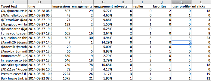
In the top right hand corner you’ll see an export function, which drops ALL of the metrics per tweet into a CSV file. Open that up in excel to see a handy view with every stat you could possibly want: (there’s much more than just the screenshot btw)
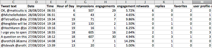
Some extremely simple data manipulation: split the timestamp column (D) using the text to columns function in excel, to splice out the date from the time, then do the same on the resulting time column to create a new column containing just the hour of the tweet, your data will now look something like this:
Now we can start doing some really cool stuff with the results:
Chart average impressions vs interactions by hour (24 hour clock format)

With this simple chart, I can see immediately that while impressions remain pretty constant I get considerably better engagement from my specific audience between 9am and 1pm – therefore this is the optimum time of day for me to schedule tweets.
Compare Average Interactions by Tweet Classification:
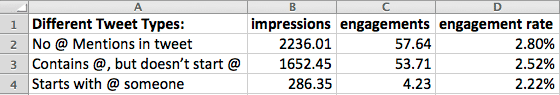
By using excel filters (begins with, contains, doesn’t contain @ symbols) you can quickly categorise your tweets to see the performance values of each one – using this knowledge I’d start using tweets with links, but no mentions of other people, between 9am and 1pm – to maximise my CTR.
More data uses:
There are hundreds, if not thousands of ways of splicing all this data together, to give you both a read on past performance for tracking improvements over time, as well as analysing the sweet spot for performances of your accounts by time, type of tweet, media type and by the form of interaction that you’re looking for.
I’d love to hear any specific use cases you might want in the comments section below, and I’ll update the post with the best!